You don't need to knock down walls or empty your savings to make a small living room feel larger. What actually changes how spacious a room looks is a set of visual principles—how light moves, how color flows, where the eye stops, and how your furniture is scaled. Designers and architects consistently work from these same levers, and once you understand them, you can diagnose your own room's specific problem and pick the tactic that solves it.
Your Small Living Room Decor Decision Framework
Start by naming your room's main challenge: does it feel dark, cramped, chopped-up, or cluttered? Each problem maps to a different visual principle, and each principle has low-cost decor tactics attached. Use this framework to match your diagnosis to the strategies most likely to pay off.
| Visual Principle | Specific Strategy | Effect on Perceived Space | Best for Solving |
|---|---|---|---|
| Manipulating Light | Large mirror across from a window | Amplifies natural light and extends sightlines, creating depth | Room feels dark or dim |
| Manipulating Light | Clear furniture (glass, Lucite, acrylic) | Light passes through; the piece visually "disappears" and doesn't block sightlines | Room feels heavy or crowded |
| Manipulating Light | Layered lighting (floor, table, wall) | Reduces shadows and visually expands corners, adding depth | Dark spots that shrink the room |
| Unifying with Color | Same paint on walls, trim, and ceiling | Creates a seamless vertical effect with no contrast lines to stop the eye | Low ceilings, chopped-up walls |
| Unifying with Color | Lighter-toned natural finishes | Reflects light and maintains an airy aesthetic | Room feels heavy or dark |
| Creating Continuous Lines | Furniture with exposed legs | Floor extends visually beneath the piece, reducing perceived weight | Room feels crowded or blocked |
| Creating Continuous Lines | Floor-to-ceiling drapery | Adds vertical rhythm and makes the window appear larger | Narrow rooms, low ceilings |
| Managing Scale | Fewer, properly scaled pieces | Reduces visual clutter and fragmentation | Room feels busy or fragmented |
The framework works because every tactic targets one of four mechanisms. A mirror and a glass coffee table both manipulate light; a monochromatic paint scheme and a leggy sofa both remove visual breaks. When you know which mechanism your room is missing, you can choose confidently instead of guessing.
Manipulating Light: Reflect, Amplify, and Disappear
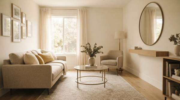
Mirrors are the classic quick fix for a reason. A large mirror placed across from a window amplifies natural light and extends sightlines, giving the room a sense of depth. Designers caution against scattering small mirrors around instead—that creates visual clutter rather than openness. Positioning mirrors so they reflect a window and the view outside steals extra light and enhances the sense of a bigger space.
Transparent materials do similar work with furniture. Tables made of Lucite, acrylic, or glass offer an airy look because the eye can see beyond them, so they don't block sightlines the way solid wood does. Louise Bradley, founder of her London-based design studio, also recommends refined furniture in lighter-toned natural finishes—soft timber veneers, silver leaf, or polished marble—to keep a room feeling light and spacious.
Finally, don't rely on a single overhead fixture. Layered lighting—a combination of floor lamps, table lamps, and wall lighting—reduces shadows and creates depth, which visually expands corners. Dark spots are what make a room read as small, and layered light eliminates them.
Unifying with Color: Seamless Transitions for Visual Flow
Color continuity is one of the most impactful and cheapest strategies available, and it works through a simple mechanism: contrast lines stop the eye. When your walls are one color, the trim another, and the ceiling white, your gaze registers each boundary—and each boundary makes the room feel smaller and boxier.
Designer Shavonda Gardner recommends painting your ceiling the same color as your walls. "It gives the illusion of more space because the eye doesn't stop at a white ceiling," she explains, noting this is especially true with dark colors. She extends the same logic to baseboards and trim, which she paints to match the walls and ceiling for the same space-expanding, gaze-continuing effect.
Interior designer Liz Potarazu makes the same point from her own practice: "I like to paint my walls, ceiling, and trim the same color to make the room appear larger. Not having a focal point where the paint color changes can make a big difference in visually creating a larger space." Whether you choose a rich neutral palette or a bolder color-drenched scheme, consistency across walls and trim is what does the work.
Creating Continuous Lines: Guiding the Eye
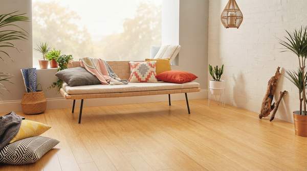
The eye reads a room as larger when it can travel without interruption, and two decor choices make that possible. The first is furniture with exposed legs. Skirted or fully enclosed bases block the floor from view. When the floor is visible extending beneath a sofa or chair, the room immediately feels less crowded. Consider sofas with raised legs, open-base accent chairs, coffee tables with slim profiles, and console tables that do not appear boxy. This is a subtle shift, but it changes the perception of weight.
The second is full-height drapery. Hanging curtains so they run floor to ceiling makes the window appear larger than it actually is, and in narrow rooms especially, the vertical rhythm softens the architecture without adding clutter. The same vertical logic applies to storage and decor: a tall bookcase pulls the eye upward, while a low, wide unit can make the ceiling feel closer than it is.
Architect Kenny Payero frames the whole principle as alignment: "Align things, equally-space things, and make a lot of different things look like one single element." He notes that he sometimes even builds out slightly to create a continuous line—counterintuitive, but proof that the unbroken line matters more than raw floor area.
Managing Scale and Proportion: Less Clutter, More Impact
The most common scaling mistake is assuming small rooms need small furniture. In practice, undersized pieces make a room feel fragmented, while properly scaled pieces with balanced proportions create a more cohesive, spacious appearance. Designer Joshua Jones, who works with small and narrow rooms, puts it directly: deep, overstuffed sectionals can overwhelm a narrow living room, and reducing a sofa's depth by just a few inches can make circulation easier and restore balance.
The same logic applies to decor. Emily Henderson's team offers a blunt rule of thumb: go big or go home, and avoid too much "bitsy" art, which will ultimately make your room feel smaller and cluttered. One substantial piece of art creates more impact—and less visual noise—than a wall of small frames.
Restraint ties it all together. Before adding anything, edit what's there: too much stuff is the elephant in the room, and no mirror or paint trick will compensate for visual clutter. Fewer, better-scaled pieces let the light, color, and line strategies above actually register.
Transform Your Space: A Principled Approach to Small Room Decor
The decision is to implement decor strategies based on visual principles to create an illusion of spaciousness and enhance functionality in your small living room—no renovation required. Diagnose first: if the room feels dark, start with a window-facing mirror and layered lighting; if it feels chopped up, paint walls, trim, and ceiling one color; if it feels crowded, swap enclosed bases for exposed legs and edit down to fewer, properly scaled pieces.
The measurable indicator is straightforward: the room feels visibly larger, less cluttered, and more comfortable, with improved light and flow. Walk in after making your changes and check whether the eye now travels without stopping—at a white ceiling, a contrast line, or a boxy piece of furniture. If it does, the principles are working, and the same framework will transfer to any other small room in your home.