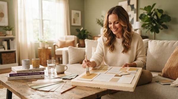
Color psychology gives you a practical way to decide what to paint before you ever open a can of paint. The core idea is simple: different colors tend to evoke different emotional responses, and you can match those responses to what a room is for. Cool tones like blue are associated with relaxation, while warm tones like red are associated with energy, according to guidance from The Interior Design Institute. That means a restful bedroom and a stimulating home office call for deliberately different palettes rather than a single color carried through the whole house.
This guide translates those principles into a decision framework you can actually use, room by room. It also covers a factor most color guides skip: how a color's surface texture and finish change the way that color feels in a space.
Understanding Key Color Associations for Interior Design
The starting point for any palette decision is the emotional character each color tends to carry. Paint guidance from Sherwin-Williams groups colors into two broad families: bright, warm colors like reds, oranges and yellows that "stimulate and uplift," and cool, peaceful colors like blues, greens and purples that are "soothing and meditative." That two-family split is the backbone of most room-by-room advice.
Within those families, individual colors have distinct reputations. Blue is widely considered a calming color, with associations of calmness and stability that suit restful spaces. Green falls on the soothing, meditative end of the cool family. Yellow brings happiness, optimism and energy, and is said to stimulate creativity and communication—though the same sources caution that too much bright yellow can become overwhelming or even anxiety-inducing. Red is the most intense of the warm colors, signifying passion, energy and excitement, which is why designers typically recommend using it sparingly rather than across large wall expanses. Neutrals—gray, beige and white—act as a versatile backdrop that promotes calm and sophistication while leaving room for accent colors and texture.
Two honest caveats belong here. First, reactions to color are not universal: each person reacts differently to each color, a point Foyr's design guidance emphasizes based on multiple studies. Second, some popular beliefs outrun the evidence. A research summary published by ArchiVinci notes that no trial links wall color to better sleep, and that the idea red raises appetite is not supported. Treat color psychology as a strong set of associations shaped by light and personal taste, not as guarantees.
Color Psychology at a Glance: Your Room-by-Room Guide
The table below is your quick-reference decision tool. Find the mood or function you want in a room, then read across the row to see which colors support it and what to watch out for. All associations reflect the design and paint guidance sources cited throughout this article, including their noted cautions.
| Color | Psychological Effect / Mood | Best Rooms for Application | Considerations |
|---|---|---|---|
| Blue | Calming; promotes relaxation and peace | Bedrooms, bathrooms | Widely considered calming for anxiety and stress; muted shades feel most restful |
| Green | Soothing and meditative | Living rooms, home offices, bedrooms | Works as a calm base that can still feel sociable; sage tones are a common bedroom choice |
| Yellow | Happiness, optimism, energy; stimulates creativity and conversation | Kitchens, dining rooms, home offices, creative spaces | Too much bright yellow can feel overwhelming; soft yellows suit warm, welcoming palettes |
| Red | Passion, energy, excitement | Intimate, cozy settings rather than whole walls | Best used sparingly, especially in bedrooms; appetite claims are not supported by research |
| Neutrals (gray, beige, white) | Calm, sophisticated, versatile | Any room, especially living rooms and small spaces | Ideal base for accent colors; light neutrals make small rooms look larger |
Use the table in one direction only: start from the mood you want, not from a color you happen to like. A homeowner who wants a calm bedroom lands on blue, green or warm neutrals; a homeowner who wants an energizing kitchen lands on soft yellow or warm white. The considerations column is where most mistakes get prevented.
Room-by-Room Color Application Guide
Here is how those associations translate into specific spaces. For bedrooms, the guidance is consistent: muted, low-saturation colors feel restful. Soft blues are widely considered calming for anxiety and stress, sage green and warm neutrals are common soothing choices, and lilac appears among frequently chosen options. If red appeals to you, design guidance positions it as a color for an intimate, cozy setting rather than a full-bedroom treatment.
Living rooms benefit from a calm base that still feels sociable—warm neutrals with green, blue or terracotta accents are a frequently recommended pattern. Kitchens and dining rooms lean warm: warm whites, soft yellow, terracotta and wood tones feel lively and welcoming, and yellow's association with stimulating conversation makes it a natural fit there. For home offices and studies, muted blue or green with warm accents aims for a space that feels calm without feeling cold, which supports focus. One caveat from the research summary: office color studies give mixed, person-dependent results, so expect some trial and error in a workspace. Bathrooms favor light, fresh colors—white, aqua, pale turquoise and stone—and light surfaces make a small room look larger, a claim supported by room-perception studies. In small rooms generally, light, low-saturation colors and a light ceiling make surfaces look farther away.
How Texture and Finish Modify a Color's Impact
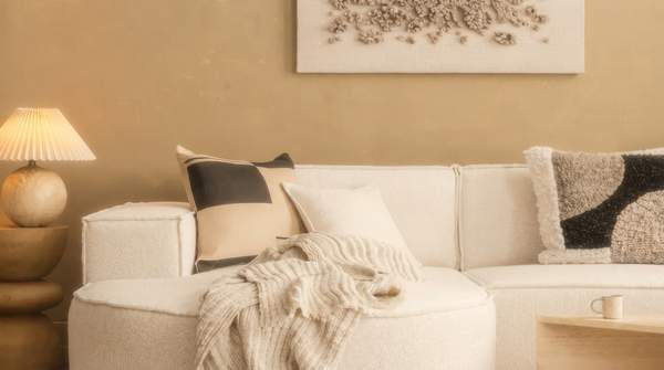
Hue is only half the decision. The same color can read differently depending on the surface carrying it, because a surface changes how light behaves before it reaches your eye. A glossy finish reflects light directly, making a color appear more vivid and energetic—the same blue that soothes on a matte bedroom wall can feel sharper and more stimulating on a high-gloss cabinet. A matte finish, by contrast, scatters light, softening the color and deepening its restful quality. Rough, textured surfaces like limewash, plaster or heavy linen do the same diffusion work even more strongly, muting intensity and adding visual calm.
The practical takeaway: when you sample a color, sample it in the finish and on the surface type you will actually use. A matte swatch will not predict how a glossy door color will feel, and a smooth sample won't tell you what a textured plaster wall in the same shade does to a room's energy.
Practical Steps for Choosing Your Home's Color Palette
Turn the framework above into a working process with four steps. First, define the room's primary function and the mood you want—rest, sociability, focus or freshness. Second, consult the color families: cool, muted tones for rest and calm; bright, warm tones for stimulation. Third, check the table's considerations column for the specific cautions, such as using red sparingly and keeping bright yellow from dominating. Fourth, test your shortlist in the actual finish and on the actual surface texture, in the room's real light, before committing.
Remember that these are associations shaped by light and personal taste, not laws. If a "wrong" color feels right to you in your space, that reaction is part of the evidence too—each person reacts differently to each color.
Designing with Intention: Your Next Steps in Color Selection
Your decision process is: define the desired mood and function of the room first, then use color psychology associations to shortlist hues that support that mood, then choose finishes and textures that either enhance or soften the color's effect. Homeowners should select color palettes for their rooms by first defining the desired mood and function, then consulting color psychology principles, and finally considering how surface textures and finishes will modify the color's impact.
Here is the measurable indicator of success: the reader successfully chooses a color palette for a specific room that aligns with their intended mood and function, and can articulate why certain textures were chosen to enhance or soften the color's effect. If you can explain—for your own bedroom, office or living room—why you picked the hue, why you picked the finish, and what feeling that combination is meant to produce, you have applied color psychology exactly as it works in practice.